Perchybana
Visualize
Visualizing Data
The Visualize module in Perch is a powerful tool used to create unique, infographic-like visual representations of your data, empowering your Perch records to become high-level views of critical pieces of information in your organization’s logs.
To create a Visualization in Perch, you’ll need to choose your data source: an Index Pattern or a Saved Search.
Index Pattern
In Perch, an Index Pattern is a filter purely around the Event Type (event_type:) of a Record. It utilizes Perch Integrations for partner software or a specific networking protocol (Flow, HTTP, TLS, SMB, SMTP, etc.) to show a view of your data that only includes the logs in that Index Pattern.
In Perchybana Discover, you can jump between Index Patterns to view just the logs around Windows (winlogbeat), Microsoft 365 (office365), AWS Cloudtrail (awscloudtrail), DNS (dns), and dozens more depending on your Perch Integrations.
Choosing an Index Pattern as a data source for a Visualization will include ALL the logs in that Index Pattern. You can filter down this data in the Perchybana Query Bar built into the Visualization module.
Saved Search
A Saved Search in Perch is a stored, unique Perchybana Query that can be used as a data source for Visualizations, so a visual representation on only a specific subset of your data is shown.
A Saved Search can also be used for repeat viewing of a Perchybana Discover Query, as it will save its Perchybana logic and the selected, sorted Fields columns you customize. It can be helpful to use a Perchybana Discover Saved Search, which you have already investigated and researched, as the baseline for a Visualization because you already have a solid understanding around the finer details of the logs in that search.
Common Visualizations
After selecting your data source, it’s good to consider what you’re looking to gain from creating your Visualization.
Are you trying to see the breakdown of a particular field? Do you want to see metric counts of different types of logs? Is there anything you could gain from seeing how certain logs are being recorded over time?
There are near endless use cases for creating Visualizations on any of the specific bits of information that can constantly change throughout your log records and IT environments in Perch. Having an understanding of what you want to represent or understand will allow for some creativity with all the different types of Visualizations, letting you find out which will catch the eye best.
The most common Visualizations used are:
-
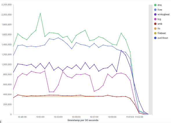
Line, area, and bar charts — Compare Counts breakdown of different fields, possibly over time, in X/Y charts. Line and vertical/horizontal bar charts are the most popular.
-
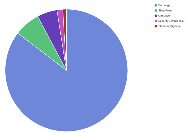
Pie chart — Displays piece of a pie (part) to the total pie (whole), can add % view, color scheming, multi-pies, and more. Typically used to view field values breakdown or % breakdown of certain log types.
-
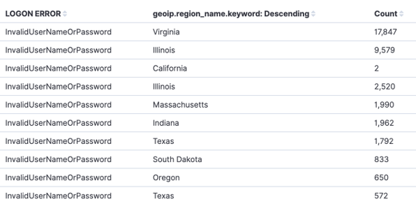
Data table — Like a miniature Perchybana Discover window. It can be used to create detailed tables with several columns and sorting, or a quick look into some important, telling data.
-
Metric — Usually displays a single number of Count, or split up groups of Count, depending on what the query is looking for and how the count may be split. Think along the lines of, “I have 100 LogA Records, but 30 are LogA1 and 70 are LogA2.”
-
Goal and gauge — On a power gauge-like view, select the parameters of how “good” or “bad” your log data might be – then view it on a speedometer-like scale of where your data falls between the “good/bad” ranges. Think along the lines of, “I should have no more than 5 lockouts per day. Any more than that is in the Danger Zone. 1-2 Green, 3-4 lockouts set to Yellow, 5 lockouts set to Red.”

Creating Visualizations
With your data representation strategy in place, let’s make the Visualization!
- Head to Perchybana > Visualize.
- Click Create Visualization in the upper right corner.
- You’ll be prompted to choose a Visualization type.
- You’ll then be asked to select your Data Source to use: Index Pattern or Saved Search.
- If you are unsure of what to pick, start with a Pie using the last-7days-records Index Pattern.
- Next is the Visualization Editing page. From here, you’ll make nearly all of your adjustments to the Visualization. Here are some of the key features and functional areas of this tool:
-
Query Bar - Some Visualization types have a built-in Perchybana Query search bar. If you chose an Index Pattern as a data source, this is a great way to filter down your search results further. If you chose a Saved Search as your data source, you can still use the Query Bar, but the Saved Search’s logic will always take priority. Use the Query Bar with a Saved Source as a Data Source to make your query even more specific.
-
Edit Pane – Different Visualizations will have different tabbed areas on this Pane for configuring how the data will look, label, conduct math, and show your data in the Visualization type you chose. While these options may seem numerous and overwhelming, great Visualizations can be set up with default configurations.
Examples of these Settings areas include:
- Data: Metrics, Buckets
- Metrics & Axes: Metrics, X + Y Axis
- Panel Settings: Settings, Grid, Threshold
- Options: Settings, Label Settings, Style, Ranges
-
Time Bar – An imperative component of any Query, Visualization, or almost any Perchybana object, is the timeframe of when the data is being searched on. In nearly all Visualizations, you can adjust the time from within the Visualization Editing page.
-
Operations – Here is a description of each Operation:
- Save – Opens a window so you can save a title and description for the Visualization.
- Share – Can generate PDF and PNG files of the Visualization, after saving.
- Inspect – Looks at the raw data the Visualization is representing, can download as a CSV.
- Refresh – Same as the Refresh button next to the Time Bar.
-
While this process of making a Visualization may seem like a lot of settings and options to configure, you’re able to make terrific looking figures just by knowing the basics and how to test effectively.
Things to know
- Most Common Settings:
- Metrics > Aggregation
- Count – Simple count of # of Records in a Query.
- Unique Count – Count, on a specific field, of the # of unique values in that field.
- Can also show unique values listed out (Data Table).
- Buckets > Aggregation
- Terms – The most common use case, able to turn a Perchybana Field into a sortable category.
- When aggregating by Terms, type in the Field name you are looking for within the Saved Search or Index Pattern.
- Date Histogram – Auto-applies time range buckets onto an axis, for tracking data over time segments.
- Terms – The most common use case, able to turn a Perchybana Field into a sortable category.
- Buckets > Split
- Split Slices/Rows/Series – Determines what the Pie/Table/Chart will split up its counting query on.
- Example – Pie > Split slices > Terms > event_type: will show a Pie divided into slices by event_type.
- Split Chart/Table – Turns the Visualization into multiple instances.
- Example – Pie > Split chart > Terms > event_type: will show multiple Pie charts that are each one representation of the top event_type:. Can be further split into slices.
- Split Slices/Rows/Series – Determines what the Pie/Table/Chart will split up its counting query on.
- Metrics > Aggregation
It’s amazing what a little effort, creativity, and need to visually represent data can accomplish in crafting awesome Visualizations!
After developing a few cool, descriptive Visualizations, it’s time to put them all into a Dashboard for greater viewing and mass querying!